Introduction
Card Component is a react component that creates a rounded card based on Material Design style guide.
Instalation
You can install it using yarn or npm
Using yarn:
yarn add @redwallsolutions/card-component-module
Using npm:
npm install @redwallsolutions/card-component-module
Props
headerText
String | undefined
subHead
String | undefined
menuOptions
Menuoption[] | undefined
media
String | undefined
supportingText
String | undefined
actions
Action[] | undefined
theme
Itheme | undefined
appearance
"default" | "primary" | "secondary" | undefined
shouldFitContainer
Boolean | undefined
Usage
Simplest Form
Hello
Header Text
Some Card Header
Header Text and Sub Head
Awesome Header
I'm awesome too :)
Menu Options
I have a menu
- Some Option
Media
Some Media
Supporting Text
Supporting Text
A nice supporting text here. It's commonly used to describe some item etc.
Only Actions
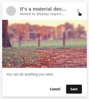
Complete Card (Dark and Light mode)
It's a material design card
Aimed to display important data.
- Dark Mode
- Light Mode
You can do anything you want.