Introduction
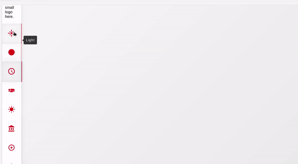
Vertical Navbar is a react component that creates a vertical navbar in the left side of the page. It behaves completely responsive when accessing it in small devices transforming the vertical navbar to a horizontal navbar at the bottom of the page.
Props
Usage
You may use this component as a wrapper of all (almost) your components.
import Navbar from '@redwallsolutions/vertical-navbar-component-module'import mylogo from './assets/mylogo.png'...<App><SomeStoreOrThemeProvider><Navbar items={[]} logo={mylogo}>{/*All your application components here/*}</Navbar></SomeStoreOrThemeProvider></App>
Passing some awesome icon
You can render anything in the icon item prop attribute.
For example, using the react-icon package or other awesome icon package of your taste:
import Navbar from '@redwallsolutions/vertical-navbar-component-module'import {MdInsertChart} from 'react-icons/md'...<Navbar items={[name: 'Dashboard', icon: <MdInsertChart/>, handler:console.log]}>{/*All your application components here/*}</Navbar>
Changing the appearance and theme
This component supports two additional props: appearance and theme.
The appearance can receive one of these three values: 'default', 'primary' or 'secondary'.
Each one of these changes completety the appearance of the component.
<Navbar appearance="primary"></Navbar>
The theme can receive an object value with the following structure:
{mode: 'light' | 'dark',default?: 'any color string'primary?: 'any color string',secondary?: 'any color string',defaultContrast?: 'any color string',primaryContrast?: 'any color string',secondaryContrast?: 'any color string',defaultDark?: 'any color string',primaryDark?: 'any color string',secondaryDark?: 'any color string',defaultContrastDark?: 'any color string',primaryContrastDark?: 'any color string',secondaryContrastDark?: 'any color string'}
The best way to understand how these attrs work together is to passing a complete
theme object with some of your favorite colors and switching the theme mode between 'light', 'dark'. To get better results,
switch also the appearance prop between the three available values.
<Navbaritems={[{name:'Some Option', icon: <SomeIcon/>, handler: someHandler}]}appearance="default"theme={{mode: 'light',primary: 'red',secondary: 'blue',default: 'green',...}}><div>I'm a pretty div content</div></Navbar>
Hooks
This amazing react feature is also present in the Vertical Navbar component. The only requirement to use it is calling it in a component that are children of the Navbar.
import Navbar, {useVerticalNavbarController} from '@redwallsolutions/vertical-navbar-component-module'...const MyContent = () => {const navbar = useVerticalNavbarController() //this will workconsole.log(navbar)return (<div>I'm just a child</div>)}<Navbar><MyContent/></Navbar>
If you try to call the controller hook outside the component, it will be undefined. 😿
import Navbar, {useVerticalNavbarController} from '@redwallsolutions/vertical-navbar-component-module'...const App = () => {const navbar = useVerticalNavbarController() //this WON'T workreturn (<Navbar>...</Navbar>)}
What can I do with hooks?
Hooks allow you to have access to Navbar Controller. This important object exposes to you some interesting methods. What about to start a built-in loadingbar automatically with fluid animations?
const MyContent = () => {const navbar = useVerticalNavbarController()navbar.startLoading() //look at the top of the pagereturn (<div>I'm just a child</div>)}
You can finish the loadingbar animation anytime.
navbar.finishLoading()
What about to programmatically set an active item of Navbar?
const MyContent = () => {const navbar = useVerticalNavbarController()navbar.setActiveItem(2) //will set the second item as activereturn (<div>I'm just a child</div>)}