Introduction
Form Component Module is a react component package that wraps up informed mechanism and applies some material design style to input and textarea components.
Installation
You can install it using yarn:
yarn add @redwallsolutions/form-component-module
Or using npm:
npm i @redwallsolutions/form-component-module
Available Components
import {InputField, TextAreaField, Form} from '@redwallsolution/form-component-module'
Props
initialValue
Any
label
String
required
leading
Any
trailling
Any
mask
((value: any) => any) | undefined
maskType
"default" | "money" | "percent" | "cel" | undefined
field
String
required
validate
((value: any) => any) | undefined
validateOnChange
Boolean | undefined
shouldFitContainer
Boolean | undefined
isMultiline
Boolean | undefined
theme
Itheme | undefined
appearance
"default" | "primary" | "secondary" | undefined
Usage
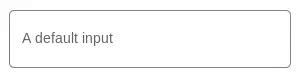
Simplest Form
The shouldFitContainer prop
It's possible to the field fit to parent width.
Password Type
With informed form
TextAreaField or isMultiline prop
You can use the TextAreaField component to an alternative for long texts.
You also can force a InputField component to behave itself as a textarea. Just pass the isMultiline prop to it.
Bugs
If you find any problem with this package, don't hesitate to open an issue on github.
Weird style bug in documentation
If you are seeing a distortion in some style, don't worry, it's only happening in docs and it will be fixed soon.