Introduction
Dropdown Component is a react component that creates a dropdown menu using many of material design guide styles.
Installation
You can install it using yarn:
yarn add @redwallsolutions/dropdown-component-module
Or using npm:
npm i @redwallsolutions/dropdown-component-module
Props
items
Iitems[]
required
visible
Boolean | undefined
origin
String | undefined
theme
Itheme | undefined
appearance
"default" | "primary" | "secondary" | undefined
Usage
Dropdown Component is very easy to use:
- Awesome Option
- Second Thing
- I ❤️ Redwall
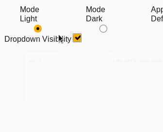
Dark Mode
It supports dark mode by passing the mode attribute from theme object. Take a look:
- Another Option
- I'm a nice option
- VERY LOOOOOOOOOOOOOOOOOOOOOOOOOOOOOOOOOOOONG
Origin
Dropdown also supports a origin prop. It's a representation of the transform-origin css prop.
In this example, we passed a center as origin prop value.
- Awesome Option
- Second Thing
- I ❤️ Redwall