Introduction
Button Component is a react component that creates a customizable button based on Material Design style guide.
Installation
You can install it using yarn or npm.
Using yarn:
yarn add @redwallsolutions/button-component-module
Using npm:
npm install @redwallsolutions/button-component-module
Props
Usage
Simplest Form
Passing a handler
Text Variant
Loading State
Customization
Theme Prop
The theme is a property used by theming-component-module. It
accepts an object with the following structure:
{mode: 'light' | 'dark',default?: 'any color string'primary?: 'any color string',secondary?: 'any color string',defaultContrast?: 'any color string',primaryContrast?: 'any color string',secondaryContrast?: 'any color string',defaultDark?: 'any color string',primaryDark?: 'any color string',secondaryDark?: 'any color string',defaultContrastDark?: 'any color string',primaryContrastDark?: 'any color string',secondaryContrastDark?: 'any color string'}
The only theme object attribute that is required is mode, it can accept either light or dark value.
The others attributes are optional and can receive a string color.
It can be a hex, rgb, or any format you want.
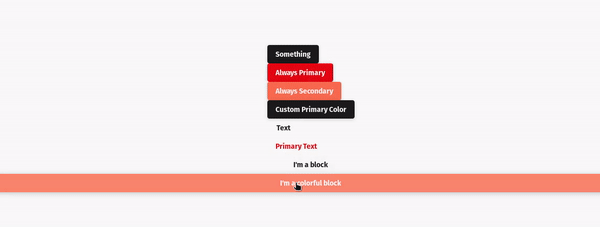
Appearance prop
The appearance is a property used to apply the correspondent theme attribute to customize the component.
For example, if you pass the following component props:
<Button theme={{mode:'light', secondary: 'green'}} appearance="secondary" .../>
Then the button will use secondary value passed to appearance prop and customize all colors related to theme attribute secondary value.
As you assigned green to secondary theme attribute, the button now is green.
Check this out: